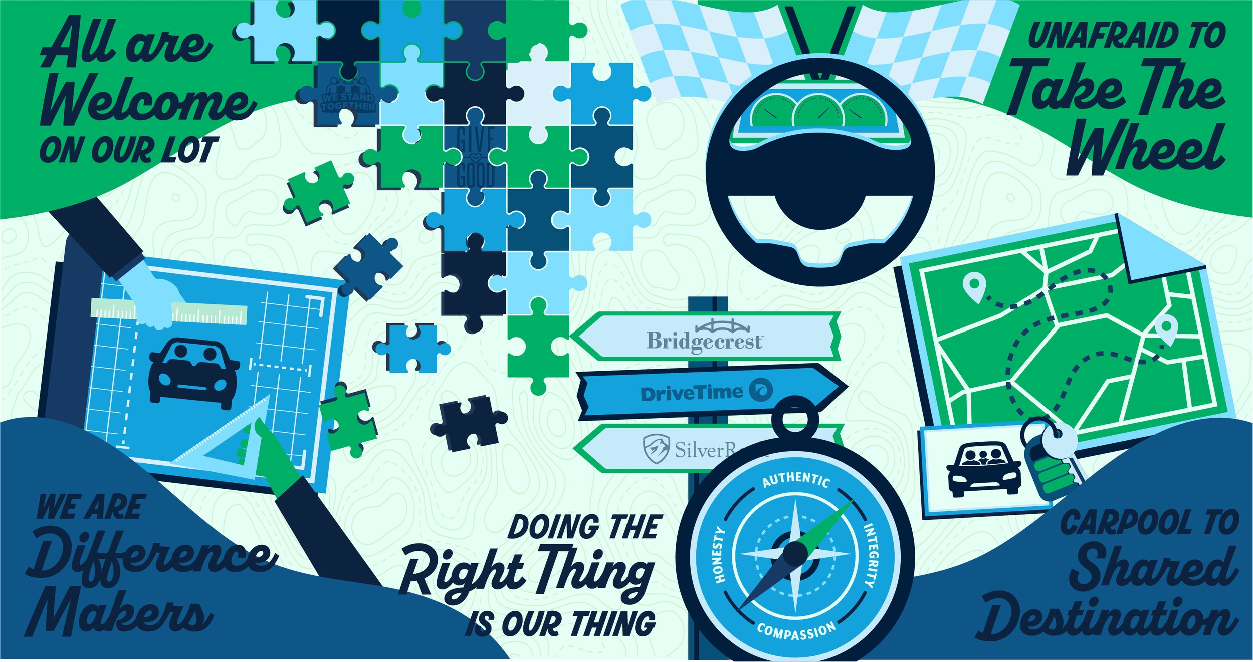
Shortly after celebrating their 25th anniversary, DriveTime was looking to update their company’s core principles identity to usher in a new era. They wanted something easily recognizable, memorable, and playful. Each core principle was designed to stand alone, but also come together to form a larger mural. Assets were created to be used for wall murals included in stores, icons and graphics for trainings, and imagery for banners used across company. Each design was also created in an alternate color pallet for a more playful feel.
WE ARE DIFFERENCE MAKERS
Core Principle ICONS
ALL ARE WELCOME ON OUR LOT
DOING THE RIGHT THING IS OUR THING
UNAFRAID TO TAKE THE WHEEL
CARPOOL TO A SHARED DESTINATION


